|
|||||||||||||||||
|
2012 Olympics | |||||||||||||||||
|
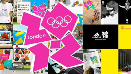
I think most views expressed on this forum concerning 2012 have missed the point. The new Wolff Olins website captures the 2012 Is not a logo in the conventional sense. It is a conduit for a larger experience. It contains things, many things; it celebrates inclusiveness and multiplicity. It is a channel for experience. A channel intended to mediate an experience without trying to control the content in a traditional, static and product-oriented manner. Old school aesthetes may not like the forms but I'm not surprised to read this from you Bruno. I consider myself highly design literate. My initial readings of the mark were indeed disjointed, which, on further reflection, is not unfavourable in terms of the overall message. The mark is textual, it creates an energetic visual buzz, independent of, and enhanced by, moving media. On further readings there are formal design principles to appreciate. There is a coherence in the letterforms, particularly once you get the 2. Clearly the negative spaces have been carefuly considered and the 'dot' in the middle creates a focal point (half-close your eyes). I find the robustness and angularity refreshing. The graphitti-esque qualities appear as a favourable and appropriate by-product of a process; not a central This is not a precious brandmark. It's a mark with a sense of scale. I suspect the shapes are derived from aerial track photographs but most importantly the shapes are containment devices. 2012 Contains the olympics. Clearly the ambitions are to stake a claim beyond the moment of the Olympic games. 2012 Is leveraging the games to catalyse and sustain development, This is a spirited identity which, I believe, warrants support from an often precious and fussy design community. I say, let go a little and let this one live gloriously. You say more about yourself than you do about the subject at hand. Not funny at all - to my mind. I do not concern myself with what I like. I concern myself with what is worth acknowledging. You present your view coercively and with poor foundation. If you have regard for branding issues you are likely to appreciate what Wolff Olins is proposing. They've always pushed the boat out in the world of branding. They are doing it again in a smart, What do you propose? 'Because they did it, therefore it must be good', is just trite. Clearly you haven't thought through your message before you included us in it. The media is not the message, the medium is the message. Praise be to Marshall McLuhan. Please show some understanding and respect for powerful ideas or be quiet. Perhaps you haven't read the previous posts. (Again to another) I have to point out to you that you say more about yourself, your experience and your process than you do about the reason the brandmark looks as it does. There is nothing audacious about the placements. What is audacious is that you say there is, particularly that you say it is a bad compromise. This is a Of course we need context. Things cannot have meaning without context. Branding is all about context. The 2012 brandmark introduces context via itself which is why we need different tools to asses its value. It does not present itself as the sole content for contemplation, it is a channel for content as well as content itself. You miss half the plot if you assess it as a thing in itself. It is a closure which contains texture and the texture it contains is open. This aspect of the brand I find very inspiring. It is particularly relevant to an audience well versed in media technologies. See the Wolff Olins website for more of the same type of thinking about brands. Blunders like this one?! Really? And who are you to pass such a judgement with such assumed authority? There are no axioms in your reasoning. The 2012 brand is presented as a total identity not as a logo. Its logo-ness is not the issue. It is your issue. Innovation is worth nothing if it is not relevant. It is impossible to be innovative for the sake of it. What you find appealling by your apparent measures are unlikely to be of consequence to a serious disscussion about branding. Please restrain yourself. You assume too much. My points stand, particularly in light of your need to resort to a dictionary. I must assume then that the subtlety and sophistication of my points have been largely missed. This is not a forum to test your English. Your comments about the brandmark were indeed reckless and presented coercively. If you say that something 'is' and do not qualify your expression as an opinion you are being coercive ie. you are attempting to manipulate what your audience thinks. Brands are highly coercive tools to realise particular agendas - usually to get people to buy goods or services. Overt coercion no longer works to achieve this in mature consumer markets. In this context brands aim to be as transparent as possible with their agendas or they fail to gain or retain the trust they need to sustain long term relationships with customers. This is why open-ended brands which encourage diversity and user-generated | |||||||||||||||||
|
Wireality is a member email forum | |||||||||||||||||
|
Top |
| ||||||||||||||||
