|
|||||||||||||||||
|
Brisbane's transformed brand identity |
|||||||||||||||||
|
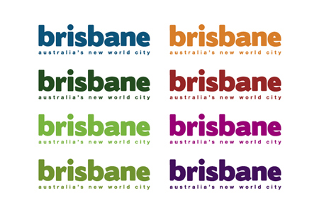
The new Brisbane identity may be consistently applied but it is also highly likely to be overlooked for more creative place brands. Or worse, held up as an example of a world-class branding opportunity missed. Surely there must be some key notion that makes Brisbane worth living in or visiting. Or, in combination, a set of notions to inspire locals and entice foreigners to add more value to the city. If Brisbane is a new world city, how has this become worth knowing beyond cold demographic statistics? Where is the heart and soul of the place when there are no press releases and other promotional material to create favourable impressions? Granted, not all identities require a big brand idea and that equity may reside in the name alone but Brisbane doesn't come pre-loaded with many curiosity inducing attributes. If by default a facilitation of more vibrant lifestyle content is intended this should be demonstrated with intent, in order to become meaningfully owned as a brand attribute. A status-oriented brandline is not going to be enough. It won't be long before the claim looks hollow and perhaps even ridiculous when things go wrong. Besides an ejection of a problematic 'man-splat', the resulting Brisbane brand identity is nothing more than an inane cosmetic make-over. And, not only is the design of the wordmark fat and clumsy but the whole identity is... ...a fat colourless conceptual cop-out. | |||||||||||||||||
|
View original post on the Brand New blog | |||||||||||||||||
|
Top |
| ||||||||||||||||