|
|||||||||||||||||
|
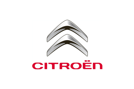
Citroën's new identity |
|||||||||||||||||
|
The new brandmark is a logical progression from the old identity and it communicates the sort of technological prowess we should expect from future-oriented car manufacturers. Agreed, the typography is on the strangely and perhaps unecessarily affected side of 'technological' and so looses out on seriousness and gravitas, but then it does have some unexpected edges and would not look out of place on a new Citroen. An additional but minor gripe may be the colour incongruency of symbol and type. This new brandmark should not be measured in terms of its value as a 'logo'. Brandmark, not logo. A brandmark represents the brand experience. A logo is something else which all too often is judged out of context. Get the language right and the brand experience follows. Citroen's brand experience led by this new brandmark looks crisp and invigorated to me. | |||||||||||||||||
|
View original post on the Brand New blog | |||||||||||||||||
|
Top |
| ||||||||||||||||
