|
|||||||||||||||||
|
Friendster's transformed brand identity |
|||||||||||||||||
|
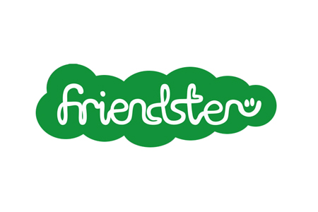
'Connecting smiles' is both enticing and evocative but in the context of Friendster's new brand identity, a touch naive. Social networks do not exist to make people happy, they exist to manage and facilitate relationships online. Happiness is only ever a byproduct of any endeavour and shouldn't be made a central focus. Even though the brand idea is of the right calibre, the overall naivety of the new identity is most fully manifested in the design of the brand. The casual and connected brandmark is appropriate but, indeed, poorly drawn. The supporting graphic system is further evidence of flagrant inexperience. Given the brand's history, a smile may have equity but unless the cliche is sharpened up, it is best abandoned altogether. And unless Friendster can offer an exceptionally better social media experience than its ubiquitous and more sophisticated competitors it is unlikely to be taken seriously beyond its existing user base. 'Up close and personal' may be how we want some of our friends in our social networks but Friendster has misinterpreted this for over-zealous and childish 'in your face' branding. It shouldn't be long before Friendsters grow up and out of Friendster, wherever in the world they are. | |||||||||||||||||
|
View original post on the Brand New blog | |||||||||||||||||
|
Top |
| ||||||||||||||||