|
|||||||||||||||||
|
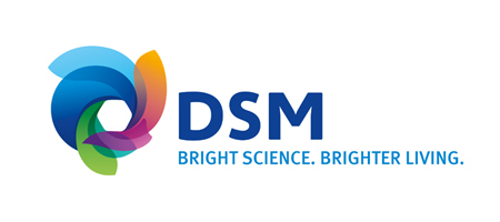
DSM's new brand identity |
|||||||||||||||||
|
Playful, approachable and energetic wins hands down over staid, mechanistic and institutional but I'd expect a Life Sciences and Materials Sciences brand to be serious, incisive and robust. Granted the symbol is iconic on a purely visual level, it looks fresh and quite proprietary on the surface, but it also looks like it's never likely to be imbued with meaning that would otherwise make it iconic in a way that really matters. There's very little about the symbol that appears to have any reason to exist other than perhaps some vague notions about what science now means to the quality of people's lives. And, yes, the symbol appears to reflect a more accessible business and, yes, there are complex modelling systems that enable rich and organic visualisations that demonstrate how science relates to every day life. But, how does a swirling vortex of transparent scales and/or feathers (symbolising complex scientific principles?) surrounding a rounded hexagon (symbolising material reality?) signify a sciences brand transformed in a purposefully directed way. Without a clear strategic or evocative creative reason for the symbol to exist I find myself invited to read ideas that work against what I'm expected to understand from the words. Besides the vague abstract relevancies that I get from the sector, the symbol invites me to read ideas that take the identity down the drain, quite literally. I don't value making identities fail for the sake of it but for a substantial organisation I expect a relevant reason to prevent me from seeking its failure. The lack of a reason for this symbol to exist makes this identity too tempting (and too easy) to make it fail. Yet again, it seems to me that a client has been seduced by design-led eye-candy at the expense of strategic insight. The enticing lightness of touch is also not enough to justify the lack of an accessible idea and so the new brand identity comes across as merely light-weight. | |||||||||||||||||
|
View original post on the Brand New blog | |||||||||||||||||
|
Top |
| ||||||||||||||||