|
|||||||||||||||||
|
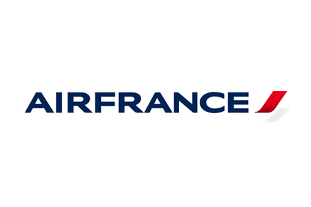
Air France's new brand identity |
|||||||||||||||||
|
The name Air France has huge equity and the new abbreviated ribbon-esque symbol is clearly an evolution of the diagonal stripes, with additional subtle but significant attributes. The new brand identity is crisp and clean but very formal and corporate. Formal and corporate normally comes at the expense of personality and uniqueness. The new look is restrained and highly disciplined but not entirely without character. I get lift, tick, near vertical takeoff and hint of a curl around the aircraft maybe but also perhaps, conceptually, of the customer. In the context of Air France the symbol suggests A and F enough to be owned, despite the generic and universal graphic language. It provides a visual shorthand for the brand which may work to iconic merit in the long term. Air France as a one word logotype is a sensible move and has the gravitas two words wouldn't have. However, I'm all in favour of shorthand brandmarks but the AF and symbol alone seems weak. The identity is already highly abstracted. 'Air France' is critical to the identity and too much is lost without the full name. I think the shorthand version should be abandoned. The hippocamp is an enigma. It's difficult to determine its worth without any apparent commitment to it as part of the identity system. The new drawing of the hippocamp is indeed elegant and as subject matter narratively rich. It seems like a job done well but also half done. | |||||||||||||||||
|
View original post on the Brand New blog | |||||||||||||||||
|
Top |
| ||||||||||||||||
