|
|||||||||||||||||
|
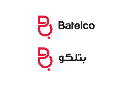
Batelco's new brand identity |
|||||||||||||||||
|
The new identity is indeed modern but the scope of what this means is extremely limited. It's a modern aesthetic; a modernisation of an arabic script in the form of a latin B, and that's about all. The result is a hybrid symbol that, although proprietary, has obvious western problems. Any visually-literate, design-oriented western person won't be hard-pressed to see a breast and nipple at the end of a heavily pregnant B, which is at obvious odds with the extremely conservative Wahhabi version of Islam practised in the region. They would, however, be hard-pressed to make sense of the infinity reference. This is the sort of half-baked and yet blatantly generic idea buried in cultural grey-land that gives brand identity consultants a bad reputation. The new identity may herald a more progressive western-style leadership prospect for Batelco but success is unlikely ever to be attributed to conceptual fecundity. | |||||||||||||||||
|
View original post on the Breathe Branding blog | |||||||||||||||||
|
Top |
| ||||||||||||||||
