|
|||||||||||||||||
|
Buell's new brand identity |
|||||||||||||||||
|
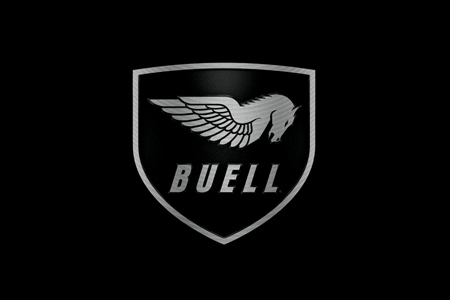
This is an enticing brand identity development. I'm inspired to look closer. Not just at the brandmark but at what Buell has in store for their riders. From a mechanical, impersonal and poorly drawn brandmark to an evocative and exciting symbol of motorcycling prowess, Buell have made the right sort of investment in their offering. Buell motorcycles have a reputation for being 'high spec' and are well regarded internationally, despite the sometimes odd designs and high cost. The shield is an interesting militaristic addition suggesting bombs, bullets and authority. The Pegasus has perhaps a touch too much detail but the stylisation is nicely handled. I get nature harnessed and re-imagined – tamed but only just... and without a doubt, fit for purpose. This new brandmark is streets ahead of the old one. I want to see this brand hit the power band and really take off. | |||||||||||||||||
|
View original post on the Brand New blog | |||||||||||||||||
|
Top |
| ||||||||||||||||