|
|||||||||||||||||
|
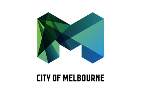
City of Melbourne's new identity |
|||||||||||||||||
|
There is an interesting structural illusion in the brandmark that doesn't allow my mind to rest on a single interpretation, much like a transparent cube or the Wittgensteinian duck/rabbit. The faceting language speaks of a multi-dimensional experience that is the City of Melbourne and the sense of celebration is palpable. This identity has many good things going for it but I would prefer to see it taken further. I expect to see a single idea or nested set of ideas to lift the identity out of an associative design-led and cosmetic exercise into a culturally relevant conceptual space expressed poetically in words. Although I like and appreciate the design idea there are aspects of it that have not been given the opportunity to mature. The faceted forms are not quite resolved. The spotlight/transparent faceted area beginning at the bottom left corner up to the top left inner edge is discordant and messy. The typeface looks raw and naive and the layout system appears wild and overly style-led. There are some good ideas in this identity but I think it won't be long before the effects wear thin and the lack of other types of ideas becomes apparent. | |||||||||||||||||
|
View original post on the Brand New blog | |||||||||||||||||
|
Top |
| ||||||||||||||||