|
|||||||||||||||||
|
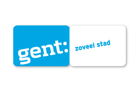
Gent's new brand identity |
|||||||||||||||||
|
This brand identity doesn't tell me anything special about the city of Gent. It does, however, have a clever modular system that suggests pocket maps (at a push) but could really be bolted onto any brand. The all lowercase and over-styled type at an angle seems arbitrary and novel for novelty's sake. Or are things a bit 'design-ery' and 'slanty' in the city of Gent?! And how is Gent 'so much city'? The content prompted by the colon seems forced and encourages overblown statements. Gent may be a charming old world city but it is hardly known for its 'cityness'. The colon made up of objects adds no real value to the overall brand, it's just another contrived and fussy design-led affectation. All the brand identity elements together give me the impression of a brand identity trying too hard. This is most likely the result of designers designing 'stuff' in the absence of strategic insights. I bet there are really interesting things about the city of Gent that would have made a much more compelling, appropriate and memorable brand identity. | |||||||||||||||||
|
View original post on the Brand New blog | |||||||||||||||||
|
Top |
| ||||||||||||||||