|
|||||||||||||||||
|
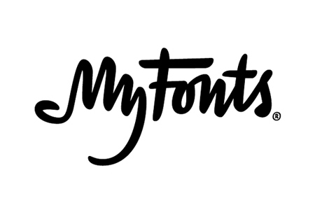
MyFonts' new identity |
|||||||||||||||||
|
I consider myself visually literate but I would have missed the hand if the blurb above didn't mention a bonus. I love visual ideas that read on additional viewings. Despite the category of typeface and the cartoony hand the idea and execution is superb. In the context of the overall brand transformation this identity gets a big thumbs up from me. | |||||||||||||||||
|
View original post on the Brand New blog | |||||||||||||||||
|
Top |
| ||||||||||||||||
