|
|||||||||||||||||
|
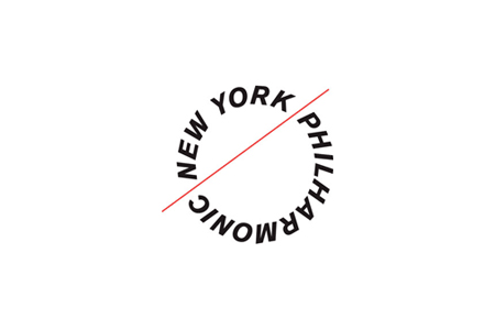
New York Philharmonic's new identity |
|||||||||||||||||
|
I can imagine additional intellectualisations. Such as the unity of audience and orchestra marked by the separation of the 'baton', which also literally represents the stage. The audience 'New York' and orchestra 'Philharmonic' make up a circle because they are interdependent and are worth little without each other. The 'baton' in the mark is itself an intellectualisation, made acceptable by the context and because Paula said it was a baton. The difficulty with intellectual design is that it is not self-evident. You need an inflated set of instructions to understand what it means, just as you need to understand a Mondrian painting. This type of work leaves the 'intuitives' feeling a little cold. Where is the warm fuzzy, the expected emotion embodied in the music it is meant to represent? Where is the rythmic, harmonious and graceful elements of say the London Symphony Orchestra? Uppercase type on a curve creates visually inelegant interruptions on the circle. Not only is it uppercase on a circle but uppercase italics on a circle. Italics are nearly always awkward and problematic without the additional complication of the circular arrangement. But it is... distinctive, counterintuitive, and confident, ... and likely to get a lot of press because it is so unexpected. So what if it upsets a bunch of uptight designers? I suspect the new identity is intended to represent a self-aware, complex and consciously orchestrated set of elements which appeal to the musicologist, who, I also suspect, get more excited by the idea of music than the sensation of music. Although I think the new identity is on the dry side of what it could have been, I think it is successful for these reasons. | |||||||||||||||||
|
View original post on the Brand New blog | |||||||||||||||||
|
Top |
| ||||||||||||||||