|
|||||||||||||||||
|
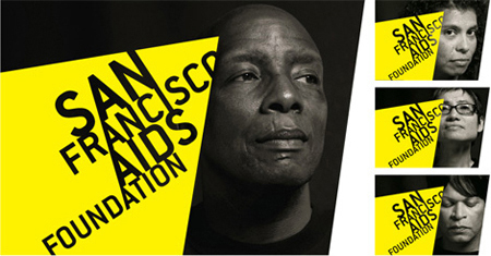
San Francisco AIDS Foundation's new brand identity |
|||||||||||||||||
|
Sure... HIV/AIDS is a persistent and uncomfortable issue. It shatters people's lives. But... do we really need to be reminded about something so painfully obvious? Sure... good, reliable and appropriate information (and storytelling) is crucial to the HIV/AIDS campaign. But... information is a means to an end. There is no apparent need to demonstrate a given. Sure... HIV/AIDS foundations need to fight for attention and sufferers need to fight to survive. But... fighting encourages fighting. An organisation of this kind fighting for attention is more likely to induce compassion fatigue. Yellow seems to have been chosen because it looks 'now', not because it helps to tell a relevant story. It can be easily spun that instead of meaningful stories of HIV/AIDS affecting all types of people in deeply personal ways, no matter how stylishly and artfully produced, letters have been urinated on sufferers and they look stigmatised and diseased. There doesn't appear to be a sustainable emotional core to this new identity. The process appears superficial and visually-driven, hence the cerebral post rationalisations. This identity is conceptually flat and the project looks like a design-led exercise. This brand identity doesn't have the strength to be gentle. | |||||||||||||||||
|
View original post on the Brand New blog | |||||||||||||||||
|
Top |
| ||||||||||||||||