|
|||||||||||||||||
|
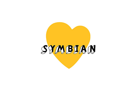
The Symbian Foundation's new brand identity |
|||||||||||||||||
|
These illustrations ooze personality. The sensitive, open and fresh drawing style is a very sophisticated take on the playful but serious world of software development, which can only realistically survive in an opensource arena. This brand identity is a clear invitation to all who can match the level of technological creativity on show. The casual relationship of the type to symbol in the brandmark tempers my aversion to the overdone heart trend in contemporary corporate communications. I've been there myself. Hearts are very tempting when an overall approach doesn't isolate any one conceptual device to represent the whole brand. Each and every one of these skillfully handled marks represent Symbian and they all work to cue a very unique brand experience. This is a huge creative win for a corporate brand of this calibre. Personally, I love it. | |||||||||||||||||
|
View original post on the Brand New blog | |||||||||||||||||
|
Top |
| ||||||||||||||||
