|
|||||||||||||||||
|
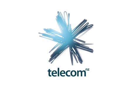
Telecom New Zealand's new brand identity |
|||||||||||||||||
|
I'd like to add personal but I see no further evidence of a personal approach. The symbol has a personal feel about it but despite the PR blurb there aren't any additional treatments to suggest that the personal is a core corporate value. An asterisk interpretation could be explored further to create personalisations and the star/snowflake is on the side of cliché for the sector but the overall handling of the identity is indeed fresh. The literal light that appears to have been used to generate the mark gives the symbol a lightness of touch and creates a sense of vibrancy and dynamism. However, instead of the inner shine that seems intended, I find that on top of the scribble the gradiated blue creates an overly messy blur. It also highlights a downward pointing arrow that works against the favourable conceptual associations of the identity. The fact that no single idea has been committed to or explored further suggests that in combination with the inherited generic name the visual ideas are being let down by strategic efforts. | |||||||||||||||||
|
View original post on the Brand New blog | |||||||||||||||||
|
Top |
| ||||||||||||||||