|
|||||||||||||||||
|
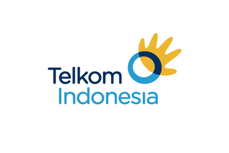
Telkom Indonesia's new brand identity |
|||||||||||||||||
|
Designers who demand a lot from work associated with big budgets, particularly designers who haven't had experience at the same level, are more likely to express off-hand, snide and facile criticisms. At worst you'll get mockery and cheap shots, with those shouting loudest and longest hoping to get their interpretations to take hold in a larger group. Sure, you could read a beak-less chicken or hurtling meteor into the work but this is not enough to discredit a competent piece of work. These interpretations only demonstrate spin. Spin usually says more about those who exercise it than it does about what is being spun. The opinions expressed on Brand New in this way are unlikely to be of any consequence. In context, the intended meanings are fairly unambiguously 'hand' and 'world', with a secondary ring idea reading strongly. These are universal symbols entirely relevant to the sector. Given the corporate nature of the work, embodied in the generic brand name, a universal and abstract approach has been called for. At the next level of accessibility a more consumer-oriented brand strategy would have been to create a separate brand. Appreciate the symbol or not, the visual language of the new identity is approachable and contemporary. This is where the real value lies. The transformed identity is energetic and youthful and a giant leap ahead of the previous identity. The new identity is not only a world apart but inhabits an entirely different reality. Objectives accomplished. Job done well. Next... | |||||||||||||||||
|
View original post on the Brand New blog | |||||||||||||||||
|
Top |
| ||||||||||||||||