|
|||||||||||||||||
|
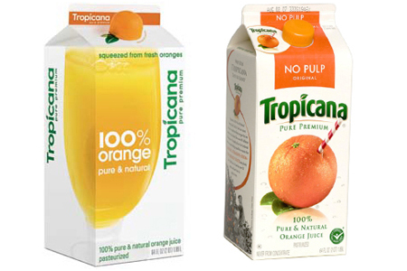
Tropicana's re-brand |
|||||||||||||||||
|
The combination of the original and the new squeeze cap will probably lack the strengths of either. Too many ideas. The original looks dated, it’s got that typical over-design of traditional FMCG packaging. And the barber’s poll of the straw looks old fashioned. I say give Arnell another go to make the squeeze cap idea really work. | |||||||||||||||||
|
View original post on the Logo Design Love blog | |||||||||||||||||
|
Top |
| ||||||||||||||||

