|
|||||||||||||||||
|
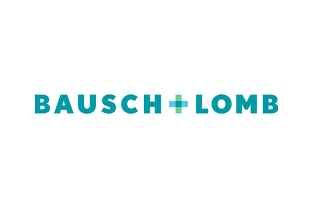
Bausch+Lomb's new brand identity |
|||||||||||||||||
|
With such a proven track record Bausch+Lomb can afford to lay claim to the medicine symbol without falling victim to outright cliche. The transparency and partnership ideas help to make this particular expression of the medical symbol proprietary. It sharpens up the cliche to secure the brand in an archetypal symbolic space. However, the rest of the brand identity under-delivers. Dax looks dated and the website 'look & feel' is on the tacky and gimmicky side of consumer-oriented 'touchy-feely', and looks far more downmarket than the smart new abstract and decidedly corporate brandmark. The reference to the new identity as a logo update in the press release is very disappointing for a company of this stature. Surely Pentagram doesn't still deal in logos?! And what is the guiding brand idea without having to read the associated ideas of transparency plus partnership into the identity? Surely the brandmarks aren't the only manifestation of these ideas? The final solution looks distinctly cerebral and only just passable as a significant upgrade for such a heavyweight eyecare brand. | |||||||||||||||||
|
View original post on the Brand New blog | |||||||||||||||||
|
Top |
| ||||||||||||||||
