|
|||||||||||||||||
|
Premier Global Services' new brand identity Brand New: Spoiler alert: The P and G are the same
|
|||||||||||||||||
|
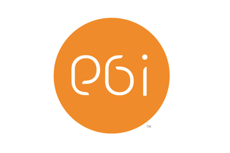
The new brand idea is... ... a long, tedious and generic corporate brand name gets a short-hand signature treatment and becomes PGi. Shorter, snappier and therefore, in time, with some luck, more memorable. Mm.. okay, and so where'd the 'i' come from? Surely joining an alphabet soup of brand names won't gain any more stand out than the full name ever did. ... literally in the letterforms. The circle represents the world and the 'i' is actually a person looking at a computer/arcade/screen-thingy waiting for another computer/arcade/screen-thingy to rotate into position ready for a conference caller in another part of the world to get connected. And, sort of like iPod but with an 'i' at the end. And, sort of suggesting PG and I (as in me, myself and I). Subtle but relevant and contemporary... sort of. ... simply a fresh visual approach to the whole brand and the serious corporate stuff doesn't matter all that much anymore. PGi aren't too worried about their brand identity or a meaningful brand idea because they now have an all-singing and dancing website with a whole stack of videos featuring self-important corporate executives and posh yachting clients talking up a storm. Besides, enough people know what PGi does and who needs a sophisticated, meaningful and legible brand identity anyway? ... a generic corporate brand gets with the slightly old-school and techy design kids who somehow represent a new generation mass-audience and therefore know how to read unconventional letterforms and don't really care about what things mean. A major cop-out on all fronts. The legacy of PGi might be an outstanding online system that ultimately survives as another more considered brand but this new identity is unlikely to deliver a brand people will remember. Yet again it seems that a 'living-in-the-90s' design agency hasn't understood that brands are not about cool logos anymore. | |||||||||||||||||
|
View original post on the Brand New blog | |||||||||||||||||
|
Top |
| ||||||||||||||||