|
|||||||||||||||||
|
Workopolis' new brand identity Brand New: A Working City Rises
|
|||||||||||||||||
|
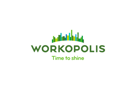
There is a lot to appreciate in this identity. It bristles with a fresh optimism and seems to be bulging with pride, people and city life. There is a lightness of touch and an effortlessness that expresses analysis, order, energy and competence. I don't need to know more about what this brand is meant to do, other than by what these few brand marks tell me. This is a brandmark full of directly relevant ideas and yet doesn't feel like it's just a logo or in need of further elucidation. The name, symbol and brandline provide me with a glimpse of what this brand does, without the need for additional contextual elements. Each time I look at this identity I find further layers of meaning that work together to cue a particular experience. The 'crown', for example, suggests 'the individual' as leading or having out-shone a crowd and yet conveys a sense of collective effort without looking contrived or coming across as patronising. Also, the view of the city from what could be a park on a hill suggests a healthy work/life balance, not to mention a new city on the rise to conquer. To shine as in 'be polished', or it's time to 'polish up' as well as express an 'inner shine' evokes not only an inspired brand that works timeously but a brand that might well shine in such a way as to re-define an industry. With this calibre of identity update Workopolis deserves success. ... out of their depth. | |||||||||||||||||
|
View original post on the Brand New blog | |||||||||||||||||
|
Top |
| ||||||||||||||||