|
|||||||||||||||||
|
Yodel's brand identity |
|||||||||||||||||
|
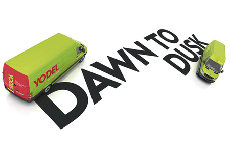
Not only is the identity pragmatic and straightforward on the surface but it is evocative beyond the call of duty, on further contemplation. This is clearly work from seasoned creatives who've seen it all before and who know what really matters. (Yo)ur (Del)ivery as a language-based concept draws on the contemporary understanding that brands cannot not be consumer-centric to be successful, without this idea as a conceptual end-point. Beyond the 'does-what-it-says-on-the-can' rationale is the obviously intended and appropriate 'yodel', a mountain call. This is a call that not only evokes the space of an epic mountain range but, considering this is a delivery service, suggests that mountains can be moved with minimum fuss. Also, considering the identity appears prominently at the point of contact, the delivery vehicles constantly advertise what the brand does and so no other graphic devices or information cues are necessary. This gimmick-free identity creates an impression of a serious brand that understands the value of evocative and meaningfully directed brand ideas. For me, this brand identity brilliantly demonstrates British pragmatism at its language-oriented and cynic-proof best. Yodel and the creative people behind the brand deserve to go the distance. OUT-BLOODY-STANDING, I say. | |||||||||||||||||
|
View original post on the Brand New blog | |||||||||||||||||
|
Top |
| ||||||||||||||||