|
|||||||||||||||||
|
Rio 2016's brand identity |
|||||||||||||||||
|
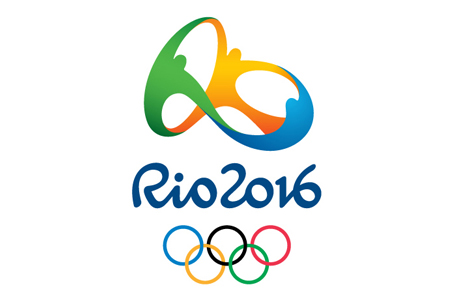
Judging by the many enthusiastic 'talking heads' on the Tatil website I don't need to understand Brazilian Portuguese to see that many people care deeply about the ideas that make up the Rio 2016 identity. They appear to care so deeply because they've clearly worked not only conscientiously but really hard. I challenge any equally large US or European consultancy to try to maintain that level of fresh and heartfelt enthusiasm without looking insincere. Sure, Rio 2016 is an 'old-school' identity but I have to say that it's the best type of 'old-school' design. It works well in it's pure design version. The symbol is harmonious and the proportions, negative space, 3 dimensionality and typography are well-considered in a modern classical sense. The identity is a collection of ideas that have been worked into a single distinctive form. There isn't a single idea that determines what it is. This is a weakness and a strength. The most accessible idea is best expressed as energetic, humanoid characters celebrating community. This is then strengthened by a number of secondary but equally satisfying ideas in the symbol and underlying brand-ideas of harmonious diversity, contagious energy, Olympic spirit and exuberant nature. The structure of the symbol is based on a relevant (and iconic) landmark and, as has been suggested, by chance or by design, reads as an abstract typographic 'Rio' for the visually literate. For me, this idea makes the overall identity particularly strong and deeply memorable. The Brazilian thong was probably unintended but has been 'intuited' into a marginally relevant reading and seems to add a richness in the best sense – by an idea that could otherwise if it weren't for the clean corporate design might be spun to smut. This and the pacifier reading is not strong enough to overpower the ideas that, all-be-they familiar design forms, actually work well together as an overall set of ideas. The universal design cliches benefit from archetypal narratives and have been sharpened up and strengthened by local relevance. What seems to frustrate most criticism of what the identity is meant to represent is that there is no single idea or insight to focus on. Any singular criticism is easily deflected and a singular critical approach just comes across as cynical and naive. To 'take down' the many interconnected and 'self-bracing' ideas that have been worked so hard (and so sincerely) into an identity that has the many and various reasons it needs to exist this successfully requires a lot more effort than most critics have attempted so far. In contrast, the London 2012 identity is definitively 'new-school' and does what should probably be expect of great British creative brand thinking. It disrupts and self-consciously counters the norm in an energetic and digitally enabled way. Now that we've lived with London 2012 for a while the disruptive element doesn't jar as much. The brand now works to achieve a similar Olympian objective of unity in diversity. And, at the same time nods towards a British punk irreverence, while, paradoxically, demonstrating an anti-mainstream and anti-design sentiment. London 2012 is an energetic, cutting edge and dissonant brand in an old-world context; Rio 2016 is an energetic, familiar and consonant brand in a new-world context. Both are equally exciting and enticing. I'm looking forward to seeing both identities put through their paces on the track and field. | |||||||||||||||||
|
View original post on the Brand New blog | |||||||||||||||||
|
Top |
| ||||||||||||||||