|
|||||||||||||||||
|
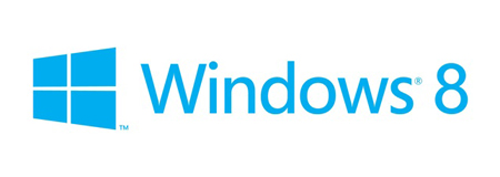
Windows 8 – The new logo |
|||||||||||||||||
|
In the context of Apple's runaway success, it's important to recognise that the redesign of the Windows logo is part of a wider transformation of the Windows brand. This redesign appears motivated by the right reasons and the appropriate amount of resource appears to have been directed at it. And, at least on the surface, it also seems that the right type of resources have been been drawn on in the services of Pentagram and Paula Scher. However... ... perhaps lost on most people, even on the supposed experts in design, there exists a set of clues that suggests none of the people involved are aware of the limitations of a design-led approach to rebranding a contemporary big product brand such as Windows. Design may have featured strongly in the success of Apple but it's a widely held fallacy, particularly among designers, that design accounts for its success. And so, it should come as no surprise that Microsoft has been lured by, what is likely to turn out to be, the 'siren' of design. Further evidence of this design-led problem comes directly from Microsoft's Metro Style Design, which appears to be the engine of an overall approach to design and primarily intended for it's user-interface and digital experience development. Kudos to Microsoft for establishing a core set of principles to direct the design of its products, but the ambitions of this effort are undermined by the emphasis on design, which is exacerbated by the use of the term 'style' to describe the project. Anyone with half a mind for philosophy in the creative industries understands that style is merely a superficial and 'field-of-view' way to understand how design adds value. Pentagram is a highly regarded global design firm. It's roots extend deep into the cultural landscape that has been strongly influenced by the role of design in society, particularly after World War 2 in the United States. Paula Scher pioneered some aspects of postmodern graphic design and has since had the good fortune to be recognised as a credible figure in the world of contemporary big brand branding (in the United States). But... ... Pentagram is first and foremost a design agency, not a brand consultancy. Paula Scher is first and foremost a designer, not a creative brand strategist. Pentagram is effectively a business-driven and loose conglomeration of design teams. It doesn't appear to have a core brand consulting methodology or a clearly defined brand-led culture. Despite some impressive big brand branding in Pentagram's portfolio it's apparent that the agency isn't best-placed to guide the Windows brand transformation. Not only does there appear to be a lack of awareness of the limitations of design in this rebrand but the heralding of the thinking in 'Your name is Windows. Why are you a flag?' by Paula Scher as a foundational insight demonstrates either an ignorance in branding logic or an implicit dishonesty. I find it hard to imagine that all those involved in this project haven't suspected that something wasn't quite right and that a key factor in the mix was absent. And, that they might have, unwittingly, spawned a dud. Further... ... if – as would be demonstrated by a top-tier brand consultancy – the new Windows logo was presented as part of a complete brand identity transformation and that its redesign reflected a single and relatively minor part of an entire experience then a criticism of the design-led aspect of this project might not be so persistent, and harsh. As a mark on its own, the new Windows logo isn't inherently bad but it is disappointingly literal, conceptually flat and embellished unnecessarily with the TM and ® symbols, which makes it look the product of the insecure and desperate. As part of a system of brand-marks such as the Windows phone tiles then at least a useful, albeit mechanical, richness will have been demonstrated and the mark then also moves away from being merely a logo and works as a straightforward and directly relevant brandmark. Even if the Windows logo was presented as a brandmark in the context of the tile-based brand-mark system I see no reason why it shouldn't retain the flat version of the previous design as used in the tiles and on the Windows phone. The 'wavy windows' isn't necessarily a flag, it's flag-like. With this in mind it's perhaps best presented as 'windows in flux' and at least retains its iconic distinction and conceptual richness. And, most importantly, also retains the equity that has taken so long to build. It's easy to over-estimate the value of design and I challenge the Microsoft leadership to recognise the difference between design and brand consulting before it too, like so many a mis-informed designer, gets drawn further into design like a moth to a flame. | |||||||||||||||||
| View original post on the Brand New blog | |||||||||||||||||
|
Top |
| ||||||||||||||||