Contact News
     
 
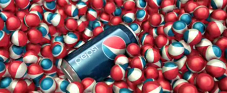
  Pepsi's new brand identity


I think the whole Pepsi identity has been compromised. Adaptability seems to have been crowbarred in. Pepsi is now something else. As much as I like the treatment of the e, in the context of the whole identity it looks like half an idea. It's not strong enough to stand on its own and if they're going to go for a minimalist look they should commit to it. It also indicates that the smiling ball is not strong enough to carry a personality. If it did then a bold piece of minimally styled typography would be enough. A smile? C'mon it's become a major cliche of contemporary branding. And it's not even a discernable smile, it's a witless, comical and cheesy grin.


View original post on the Brand New blog


Top