|
|||||||||||||||||
|
De-cluttering brandmarks
Visual Shizzle: De-clutter |
|||||||||||||||||
|
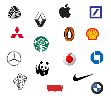
The proposed treatment is also an opportunity to demonstrate a more effective language to handle brands. A branding language that only refers to logos in the old-fashioned and limited context of corporate identity, when, historically, brands were only thought of as consumer products and when the business and consumer brand overlap was less common than it is today. Apple, Penguin and Shell are rebuses and so carry the brand name without the need to spell it out. Puma is another contender for changing the relationship of its symbol to its wordmark in the same way. However, even for these brands the full power of the identity is limited to English speaking markets. And, this treatment doesn't work quite as well for brands such as BMW, Mitsubishi, Deutsche Bank, Michelin, Renault and (even) Nike. A brand with a symbol that has no implicit relationship to it's name is even more unlikely to benefit by dropping the wordmark. Despite Shell's powerful, long-heralded and long-established rebus the brand still chooses to use a wordmark in most contexts. As for how any of these 'de-cluttered' brands can be described as a having a logo, could it be that both symbols and wordmarks qualify as logos outside of the traditional lock-up of the symbol and wordmark? But, if so, no one is saying this and such a possibility seems not only improbable but confused. Never mind the fact that a discussion about logos looks a bit ridiculous in the context of a brands versus logos debate. And, bearing in mind the recent pronouncement of the death of the logo and the emergence of thinking about brands as discrete worlds of experience it should be clear that logos aren't worth much without the experiences that they not only represent but also lead and cue. In the context of these discussions it should be obvious that logos aren't as important as most people appear to believe. It's also not so much a case that the brands featured have the authority to work with their symbols alone, it's more that these symbols have acquired sufficient meaning to cue the brand experience associated with them. However, the chances are that these brands will always need their names spelled out in a wordmark somewhere within the brand experience, even if this is just as a straightforward and non-proprietary typeface. As entrenched in some cultures as some of these brands are, none of them are likely ever to get away with not having an explicit brand name expressed in a wordmark, particularly if the symbol is not a rebus. And, even if they do employ an easily identified rebus, the rebus is largely restricted to the brand's native language. There are many benefits to cuing a brand with a symbol exclusively in some instances within a brand-world but there are far too many disadvantages to not employing a wordmark at all. Talk of a brand's logo is not only outdated, it is imprecise. For example, when does a symbol alone qualify as a logo? And, how does a brand whose symbol is handled independently of the wordmark have a single identifiable logo such as in the case of Shell, McDonalds and Starbucks? And then, which part of these identities qualifies as 'the logo'? Is it the symbol, wordmark or do both wordmarks and symbols qualify as equally important logos? With this in mind the term 'logo' appears not only not to have been thought through properly but, in the context of a more sophisticated branding language, seems wholly inadequate. It appears that the time has come to employ a more flexible and precise branding language. In short, I have proposed that this includes referring to any (and every) type of mark that makes up a brand as a brand-mark of which a single mark is primary, regardless of whether the mark is a symbol or wordmark, or any arrangement of the two, or even any other type of mark within a brand experience. In theory a brand-mark can be any type of mark that falls into or across three brand-mark types: linguistic, material and gestural. There appears to be no shareable human experience that lies outside of these three categories. The primary mark of a brand in a branding language based on brand-marks is the brand name but it makes sense to refer to the primary material brand-mark slightly differently in the spelling as one word, 'brandmark', if a distinction is necessary, or if an upgrade from the term logo gets recognised. If there are multiple but equally important top-level brand-marks they should be further qualified as symbols, soundmarks, brandlines, wordmarks etcetera, but, regardless, whatever the type of mark, the mark will always qualify as a brand-mark. As a side note, the term 'wordmark' is more precise than the outdated term 'logotype'. The term 'logotype' makes sense in the context of logos and the term 'wordmark' makes sense in the context of brand-marks. A logo is a logo is a logo but a brand is an experience made up of all sorts of marks. A traditional logo works in association with brand experiences but brand-marks work as implicit management and change (as well as changeable) agents across a broad, rich and immersive range of experience types. A brand identity is the sum total of a brand experience determined by brand-marks and so it seems prudent to abandon the limited scope and confusion associated with thinking in terms of logos. The proposed treatment above is unlikely ever to be a complete abandonment of the wordmark but, instead, a move to place greater emphasis on the symbols of brands once they've gained sufficient cultural equity. And, in terms of a new branding language (such as I've mentioned above) it's not so much that logos are dead but it's time that branding people recognised that thinking in terms of logos is extremely limited – limited to the point of obsolescence. If you aren't speaking to your clients in these or similar terms isn't it time you started? | |||||||||||||||||
|
View original post on the Visual Shizzle blog | |||||||||||||||||
|
Top |
| ||||||||||||||||