|
|||||||||||||||||
|
Technical details about Peru's new brand identity |
|||||||||||||||||
|
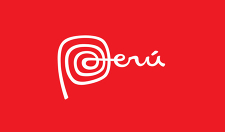
Peru's brandmark (aka logo) best qualifies as a wordmark wherein the brand-idea is embedded. The 'P' is also not technically a symbol because its specific form cannot be easily extracted from the wordmark without compromising the integrity of the brandmark. The strength of Peru's brand identity is that the brand-idea is flexible and the visual idea found in the 'P' is easily recognised in the other visual elements that help to describe the brand experience. And, these other visual elements that express the brand-idea are also marks. All the various types of marks of a brand experience are best handled as brand-marks (hyphenated because there are many different types of brand-marks) and the wordmark is the brandmark (unhyphenated because there is only one). A brandmark can be made of any standalone element or combination of symbol and wordmark, whichever is regarded as the primary brand-mark outside of the linguistic brand-mark (usually the brand name). It may be easier to talk of a brand's marks of which one is primary and refer only to this privileged mark as the 'brandmark'. The point remains that all the marks of any experience describe a brand identity no matter what the type of brand, the type of marks or the medium (material, linguistic, acoustic or gestural). More about these technical terms here. | |||||||||||||||||
|
View original post on the What's the Beef blog | |||||||||||||||||
|
Top |
| ||||||||||||||||