Asterisk is a Hong Kong-based globally managed forex hedge fund lead by experienced traders utilising the latest in digital trading technology and assisted by a responsive global network of multi-lingual support staff. Asterisk is a premium online investment brand and represents live-trading at its best, delivering an unparalleled investment experience for the discerning investor. Secure accounts and real-time user-specified feedback ensures as much transparency as a possible. And, in combination with industry standard payment systems ensures familiarity for established investors and helps to instil confidence in first time investors. Asterisk is a Forex Hedge Fund that puts the customer first to create a wealth generation experience like never before.  |
|
|
| Wiloh is an apparel brand created for eco-aware people who actively pursue sustainable lifestyles. These are the highly networked who socialise extensively via digital media and seek to make informed environmental impact choices about the everyday fashion they choose. To embody the ambitions of this demographic the 'ecosocial' concept was developed. The ecosocial idea inspires a community of creative people from around the world to create graphic messages promoting ecological and sustainability issues through Wiloh. Wiloh is itself an ecosystem of suppliers, designers and consumers who lead the way by being ecosocial.
|
|
|
Eksmo is one of Russia’s largest publishers meeting the challenges of a highly competitive market place that requires the publishing of content via traditional, new and emerging media. A ‘turning point’ idea has been adopted to demonstrate the role Eksmo plays in the Russian publishing world. Eksmo is a turning point for authors, business partners and readers. The brandmark is a literal representation of the turning point, made up of two dynamically intertwined Es that read in uppercase for Russian and lowercase for English audiences.
|
|
|
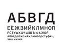
Life Bank is a large Russian bank offering services in mid-tier corporate, SME and retail banking with a strong retail presence in major centres throughout Russia. 'The essence of life' was chosen as the theme for the collateral brandstyle. The collateral graphic idea is inspired by DNA sequencing images and serves as an iconic brand signifier heralding the continued expansion and transformation of the Life Bank brand. A complete brand identity typeface was required across the whole alphabet in both Russian and English as well as a tweaked descriptor typeface in both languages.
|
|
|
Stretch is a brand-focused creative culture. Stretch has defined a brand consulting practice that is founded on a particular type of language to nurture and manage creative resources in service of Stretch Brands. This practice is underpinned by a philosophy that determines a unique opinion-centred methodology that includes a proprietary brand model for grasping every aspect of a brand. Stretch enables brands to interact in a type of bartering system based on a theoretical Stretch Currency. This provides an elastic creative environment within which brands can exchange value, with the aim of stretching individual brands and also stretching the collective Stretch brand. Stretching all aspects of a brand ensures that the most inspired solutions for brand creation and management are found. Although still in its infancy, Stretch is a different kind of brand consulting.
|
|
|
Inspired by ‘infinitely digital’, Resaura's new identity brought their web development and internet consulting business to the next level. The golden yellow pixel burst is an aura surrounding a very simple lowercase pixel R, suggesting an ultimate point in an infinitesimal digital space. The slightly curled letterforms represent the intuitive and human side of internet consulting, to humanise the grid of the digital and analytical world of web development.
|
|
|
Understanding Individual Needs is an online information resource for people affected by learning disabilities and mental illness. Backed by Voyage, a brain injury service, Understanding Individual Needs also benefits from the support of the parent group Paragon Healthcare. The Understanding Individual Needs brand identity follows a symbolic life journey represented by a line that becomes confused and dis-oriented as a result of mental health problems, emerging changed and re-oriented as a result of the resource provided by Understanding Individual Needs and all the services provided within the Paragon Group of companies.
|
|

|
Securicor's long-trusted security systems are second to none in the physical world. With new highly secure encryption technology readily available it made sense to translate Securicor’s brand equity into a portal for a secure online retail experience. In a market reluctant to use credit cards on the internet Safedoor entered the UK market and the brand was launched with a mainstream advertising campaign. At the core of SafeDoor is Securicor, represented by the Securicor corporate purple. Unrestricted by gravity the floating overlapping organic fields of orange and blue lend a light touch to the serious world of secure online transactions.
|
|
|
Zishi added another dimension to customer relationship management by going mobile and in so doing re-defining the value of time for travelers. Mobile Customer Relationship Management (MCRM) is the high tech foray into time management for the travel industry by providing travel information and suggestions to mobile handheld devices on the fly using a dynamic customer relationship database. The Zishi brandmark is inspired by futuristic coded letterforms and the dots symbolise radar arcs. The proprietary letterforms are designed to suggest continuity between travel events and discrete units of time.
|
|
|
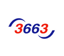
| Booker needed to shake up a tired brand as well as signal a dramatic change for a major player in a stale and traditional foodservice marketplace. A new type of foodservice company was born in 3663. Three Double Six Three is a thoroughly modern kind of foodservice brand in the business of delivering high quality ingredients to restaurants, fast food outlets and hotels in the UK. The name was born of an iconic symbol of mobility, the mobile phone. The letters F.O.O.D typed out on an alphanumeric keypad are 3663. Three Double Six Three is a dynamic and thriving brand with a huge fleet of delivery vehicles delivering food throughout the UK. Three Double Six Three is a radically different foodservice brand committed to supplying high quality ingredients in the quickest and freshest manner possible. |
|
|