|
|
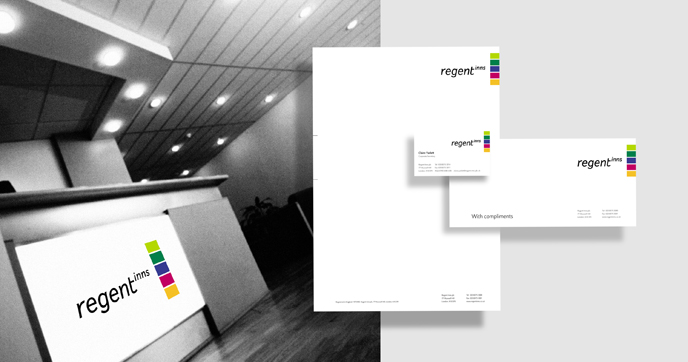
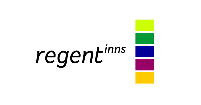
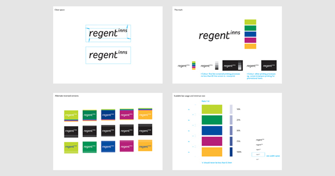
| Regent Inns is a holding company for a group of young person’s venues and an assortment of English pubs. Listed on the London Stock exchange, Regent Inns was a well respected financial company that needed a new identity. The original identity lived in the past, using heraldic and traditional regency symbols. The Regent Inns identity was modernised with a clean san serif and five bars of colour for the symbol. The bars are a rebus (bars and pubs are synonymous) and each bar has a colour name drawn from the industry – Fresh Lime, Cool Green, Regent Blue, Warm Claret and Amber Glow. Unusually, wherever possible, the placement of the symbol of the brandmark gets set flush against the edge of the format and the bars in the symbol are designed to change proportions whenever possible |
|
|
|
|
|
Sector

Financial – Leisure
Info
Holding company for young persons venue franchises and assorted English
pubs
| |
Project
Brand transformation
Role
Brand identity designer
| |
Authorship
Brandmark, basic guidelines and final artwork for key items
Consultancy credit
Dragon Brand Consulting
| |
|